Mobile optimization has become crucial for any eCommerce website, and WooCommerce is no exception. With an increasing number of customers making purchases using their mobile devices, it’s essential to ensure that your WooCommerce store provides a seamless and user-friendly shopping experience. This comprehensive guide will walk you through the process of mobile optimization for your WooCommerce site, discussing specific tips, considerations, and advice. Additionally, we’ll provide links to helpful tools, training, and other resources to assist you in your optimization journey.
- Choose a responsive theme:
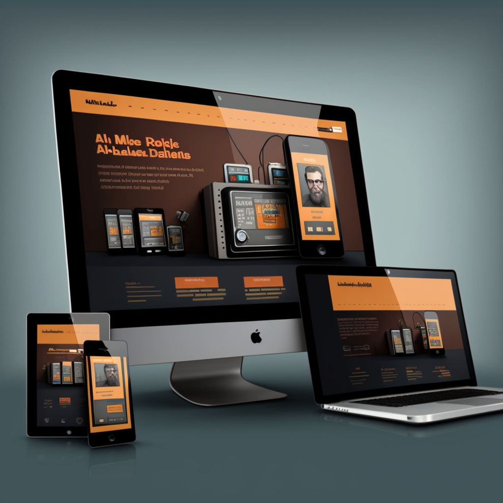
The first step in mobile optimization is selecting a responsive theme for your WooCommerce store. A responsive theme adjusts the layout of your site to fit any screen size, ensuring that your site looks and functions well on all devices.
- WooCommerce Storefront: https://woocommerce.com/storefront/
- ThemeForest: https://themeforest.net/category/wordpress/ecommerce/woocommerce
- Optimize images:
Large and unoptimized images can slow down your website, especially on mobile devices. Optimize your images to ensure they load quickly and efficiently.
- Compress images using tools like ShortPixel (https://shortpixel.com/) or TinyPNG (https://tinypng.com/)
- Use adaptive images, which automatically resize based on the user’s screen size, using plugins like WP Retina 2x (https://wordpress.org/plugins/wp-retina-2x/)
- Implement a mobile-friendly navigation menu:
A mobile-friendly navigation menu ensures that users can easily navigate your site on a smaller screen. Consider using a collapsible or “hamburger” menu that only expands when tapped.
- Max Mega Menu (https://wordpress.org/plugins/megamenu/)
- Optimize your site for speed:
Slow-loading websites can lead to higher bounce rates and lost sales. Optimize your site’s speed to enhance the user experience and boost conversions.
- Use a caching plugin like WP Rocket (https://wp-rocket.me/) or W3 Total Cache (https://wordpress.org/plugins/w3-total-cache/)
- Optimize your database with a plugin like WP-Optimize (https://wordpress.org/plugins/wp-optimize/)
- Leverage a Content Delivery Network (CDN) to speed up content delivery, such as Cloudflare (https://www.cloudflare.com/) or StackPath (https://www.stackpath.com/)
- Optimize for touch:
Ensure that buttons, links, and form elements are large enough and spaced adequately to accommodate touch interactions on mobile devices.
- Use a plugin like Advanced Custom Fields (https://www.advancedcustomfields.com/) to customize the appearance and spacing of elements
- Test your site’s usability on various devices using Google’s Mobile-Friendly Test (https://search.google.com/test/mobile-friendly)
- Simplify the checkout process:
A complex or confusing checkout process can lead to abandoned carts. Optimize your checkout process to make it as simple and seamless as possible for mobile users.
- Use a plugin like WooCommerce One Page Checkout (https://woocommerce.com/products/woocommerce-one-page-checkout/) or WooCommerce Direct Checkout (https://quadlayers.com/portfolio/woocommerce-direct-checkout/)
- Integrate popular mobile payment options like Apple Pay, Google Pay, or PayPal (https://woocommerce.com/payments/)
- Test and monitor your site’s performance:
Regularly test and monitor your site’s performance on mobile devices to identify and address any issues that arise.
- Use tools like Google PageSpeed Insights (https://developers.google.com/speed/pagespeed/insights/) or GTmetrix (https://gtmetrix.com/) to analyze your site’s performance
- Monitor your site’s traffic and user behavior with Google Analytics (https://analytics.google.com/)
Conclusion:
Mobile optimization is essential for the success of your WooCommerce website. By implementing the tips and best practices outlined in this guide, you can create a mobile-friendly shopping experience that caters to the needs of your customers and leads to increased conversions.
- Optimize for search engines:
Improving your site’s visibility on search engines is essential for attracting mobile users. Implement search engine optimization (SEO) best practices to help your site rank higher in search results.
- Use an SEO plugin like Yoast SEO (https://yoast.com/wordpress/plugins/seo/) or Rank Math (https://rankmath.com/)
- Optimize your site’s meta tags, headings, and URL structure
- Create high-quality, engaging content that provides value to your audience
- Utilize Accelerated Mobile Pages (AMP):
AMP is an open-source initiative that aims to improve the mobile browsing experience by enabling faster-loading pages. Implementing AMP on your WooCommerce site can help improve user experience and search engine rankings.
- AMP for WP (https://wordpress.org/plugins/accelerated-mobile-pages/) or The Official AMP Plugin for WordPress (https://amp-wp.org/)
- Leverage Progressive Web Apps (PWA):
PWAs combine the best of web and mobile apps to deliver an app-like experience to users on mobile devices. By converting your WooCommerce store into a PWA, you can offer an improved mobile experience that may lead to increased engagement and conversions.
- SuperPWA (https://superpwa.com/) or PWA for WP & AMP (https://wordpress.org/plugins/pwa-for-wp/)
- Offer personalized experiences:
Offering personalized experiences can improve user engagement and drive more conversions. Tailor your site’s content, product recommendations, and promotions based on the user’s browsing history, preferences, and location.
- Use plugins like Beeketing for WooCommerce (https://beeketing.com/woocommerce) or YITH WooCommerce Recently Viewed Products (https://yithemes.com/themes/plugins/yith-woocommerce-recently-viewed-products/)
- Stay up-to-date with best practices and industry trends:
The world of eCommerce is constantly evolving, and it’s important to stay informed about the latest trends and best practices in mobile optimization. Subscribe to industry newsletters, follow eCommerce influencers, and attend webinars or conferences to stay ahead of the curve.
- WooCommerce Blog (https://woocommerce.com/blog/)
- A Better Lemonade Stand (https://www.abetterlemonadestand.com/)
- Shopify Blog (https://www.shopify.com/blog)
By implementing these tips and best practices, you can create a mobile-optimized WooCommerce website that delights your customers and drives more sales. Don’t forget to continually monitor, test, and refine your site to ensure that it continues to meet the needs and expectations of your mobile users.